A street vendor selling maps of Africa in Bujumbura, Burundi Thomas Mukoya/Reuters; Shutterstock.com (background)

Standards

Rethinking the World Map

A global campaign is pushing for a map that shows Africa’s true size. Will the world listen?

Pop quiz! What’s bigger: Africa or Greenland? If you checked a map and found it hard to tell, you were probably looking at a Mercator projection. That is the type of map commonly used in schools and books, and online. On the Mercator map, Greenland appears roughly the same size as Africa. In reality, Africa is about 14 times larger.

This isn’t a mistake. It’s a consequence of projecting a spherical Earth onto a flat surface. Yet a growing movement called #CorrectTheMap is challenging the Mercator map’s dominance. The campaign advocates for alternatives such as the Equal Earth projection, which represents landmasses closer to their true sizes, though it slightly distorts individual countries’ shapes.

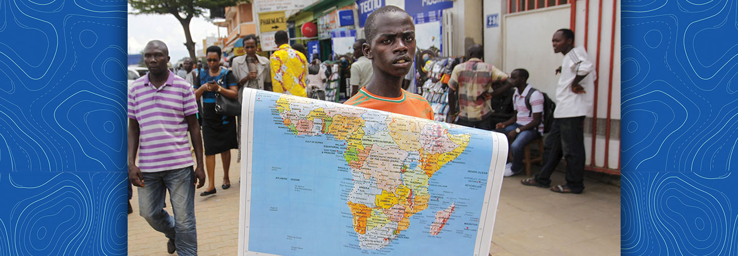
The African Union, representing the continent’s 55 nations, recently endorsed the #CorrectTheMap campaign. African Union officials say it’s about more than cartographic accuracy. It’s about changing how people view Africa and Africans.

The Mercator projection dates back to 1569, when Flemish cartographer Gerardus Mercator created it during the age of exploration. At the time, maritime navigation was often inexact, with sailors relying on compasses, stars, and knowledge of ocean currents. Mercator designed his projection to make traveling the oceans easier.

Pop quiz! Which is bigger, Africa or Greenland? It might be hard to tell if you looked at a map that was a Mercator projection. This type of map is commonly used in schools and books, and online. On the Mercator map, Greenland and Africa appear to be almost the same size. Africa is actually about 14 times larger.

Projecting a spherical Earth onto a flat surface causes the sizes to look similar. Now there is growing movement called #CorrectTheMap that is challenging the dominance of the Mercator map. The campaign advocates for alternatives such as the Equal Earth projection. This map represents landmasses closer to their true sizes. However, it slightly changes the shapes of individual countries.

The African Union, which represents the continent’s 55 nations, recently endorsed the #CorrectTheMap campaign. African Union officials say it’s about more than map accuracy. It’s about changing how people view Africa and Africans.

The Mercator projection dates back to 1569. A Flemish cartographer named Gerardus Mercator created it during the age of exploration. At the time, maritime navigation was often inexact. Sailors relied on compasses, stars, and knowledge of ocean currents. Mercator designed his projection to make traveling the oceans easier.

Beyond Navigation

Jim McMahon

True scale: The United States fits inside Africa, putting the continent’s vastness into perspective.

Even back then, maps employed a system of imaginary lines called latitude and longitude to form a grid navigators used to pinpoint any location on Earth. Many maps of the period featured curved lines of longitude, mirroring those found on a globe. Mercator’s projection was a game changer: It used straight lines of latitude and longitude that intersect at 90-degree angles. This simplification allowed sailors to plot direct routes more easily.

“You could identify on the map a place of origin and a destination and draw a straight line between the two,” explains geographer Mark Monmonier.

But to present lines of latitude and longitude as a perfect grid, the Mercator map has to stretch and shrink parts of the world. As a result, the projection progressively exaggerates the size of landmasses as their distance from the equator increases. Regions such as Africa and South America appear much smaller than they really are, while places near the North and South Poles, such as Greenland and Antarctica, look much larger. The Mercator projection also distorts the United States, making it appear stretched and larger than it should be relative to equatorial regions. On a Mercator map, the U.S. appears comparable in size to Africa, but in reality, Africa is far larger—so large that the U.S., China, India, Japan, Mexico, and much of Europe could all fit together inside it.

Even back then, maps used a system of imaginary lines called latitude and longitude. The lines are used to form a grid that navigators can use to find any location on Earth. Many maps of that time period featured curved lines of longitude. They looked like those on a globe. Mercator’s projection was a game changer. It used straight lines of latitude and longitude that intersect at 90-degree angles. This simplification allowed sailors to plan direct routes more easily.

“You could identify on the map a place of origin and a destination and draw a straight line between the two,” explains geographer Mark Monmonier.

But to create a perfect grid of longitude and latitude, the Mercator map
has to stretch and shrink parts of the world. This caused the size of landmasses to increase as their distance from the equator increases. Regions such as Africa and South America appear much smaller than they really are. And places near the North and South Poles look much larger. The Mercator projection also distorts the United States. It makes it appear stretched and larger than it should be relative to equatorial regions. On a Mercator map, the U.S. appears comparable in size to Africa. But in reality, Africa is far larger. The U.S., China, India, Japan, Mexico, and much of Europe could all fit together inside Africa.

‘Maps shape how we compare and think about different regions.’

Today ship captains on the high seas rely on GPS and electronic navigation systems rather than printed maps to determine their routes. But maps are still used for much more than navigation. They help people visualize the world, including how countries appear in relation to each other. That gives maps influence over public perception, according to Jack Swab, a geographer at the University of Tennessee.

“Maps shape how we compare and think about different regions,” he says.

Organizers of the #CorrectTheMap campaign argue that if maps show Africa looking smaller than other continents, people might infer that it’s less important. Africa has 1.5 billion people, while Greenland, for example, is home to fewer than 57,000.

“In a world where size is often equated with power, misrepresenting Africa’s true scale reinforces harmful misconceptions about its . . . significance,” they state.

Today ship captains rely on GPS and electronic navigation systems rather than printed maps to determine their routes. But maps are still used for much more than navigation. Maps help people visualize the world, including how countries appear in relation to each other. Maps influence how people view the world, according to Jack Swab, a geographer at the University of Tennessee.

“Maps shape how we compare and think about different regions,” he says.

Organizers of the #CorrectTheMap campaign argue that if maps show Africa looking smaller than other continents, people might think that it’s less important. For example, Africa has 1.5 billion people. Greenland has fewer than 57,000.

“In a world where size is often equated with power, misrepresenting Africa’s true scale reinforces harmful misconceptions about its . . . significance,” they state.

Navigational Novelties
Some of the inventions that facilitated exploration around the globe

A New Standard?

The campaign is calling for the United Nations and the global community to embrace the Equal Earth map as a new standard. So far, #CorrectTheMap has amassed more than 10,300 signatures, and with the African Union’s support, more international groups and governments might follow suit.

But making the switch would require a major global effort. Countless nations, books, websites, and organizations use Mercator-style projections. Plus, some geographers point out a fundamental limitation: No flat map of a round world will ever be perfect. Still, Monmonier says, the Equal Earth projection is “a pretty good one.”

For campaign organizers, though, the effort goes beyond simply ensuring the precision of our maps.

“It is more than geography, it’s really about dignity and pride,” says Fara Ndiaye, co-founder of Speak Up Africa, one of the nonprofit advocacy organizations leading the campaign. “Maps shape how we see the world and also how power is perceived. So by correcting the map, we also correct the global narrative about Africa.”

The campaign is calling for the United Nations and the global community to adopt the Equal Earth map as a new standard. #CorrectTheMap has gathered more than 10,300 signatures so far. And with the African Union’s support, more international groups and governments might follow suit.

But making the switch would require a major global effort. Countless nations, books, websites, and organizations use Mercator-style projections. Some geographers also point out that no flat map of a round world will ever be perfect. Still, the Equal Earth projection is “a pretty good one,” Monmonier says.

For campaign organizers, though, the effort goes beyond simply making maps precise.

“It is more than geography, it’s really about dignity and pride,” says Fara Ndiaye, co-founder of Speak Up Africa, one of the nonprofit advocacy organizations leading the campaign. “Maps shape how we see the world and also how power is perceived. So by correcting the map, we also correct the global narrative about Africa.”

With reporting by Saikou Jammeh of The New York Times and Lucia De Stefani.

With reporting by Saikou Jammeh of The New York Times and Lucia De Stefani.

Jim McMahon

The Mercator projection (above) uses a flat grid, which makes landmasses near the poles appear larger.

Jim McMahon

The equal Earth projection also distorts the shapes of countries but shows them much closer to their true size.

videos (1)
Skills Sheets (3)
Skills Sheets (3)
Skills Sheets (3)
Leveled Articles (1)
Text-to-Speech